


Below is a sample of the emails you can expect to receive when signed up to Colorcom.
Hello Andrew,
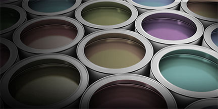
Fall is the time of the year when �The Color of the Year� makes the news. It all begins in summer when paint companies reveal their trend forecasts. These are usually teasers that cover a wide range of colors � and in some cases dozens of colors, as was the case with Sherwin Williams� 45 hues. And now it�s final. Five noteworthy brands have revealed the �it� color � "The Color of the Year 2020". Is it any coincidence that all of these colors hold a promise of calm for what lies ahead?
Test your color imagination
First, have some fun and test your imagination:
Assume that each of these two colors will be �The Color of the Year 2020�. The challenge is to reinvent the color by giving it an evocative new name. You might even consider giving it a name that embodies a sense of calm.
#1 A light pink
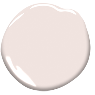
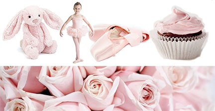
If you had to reinvent this pink with a name that would get rid of all these associations � and have mass appeal � what would you name it?
Consider this: Some paint brands have named this tender hue �Pink Ground� or �Calamine� (Farrow & Ball), an almost identical color �Almost Pink� (Glidden), �Paris Pink (Portola Paints), �Pink Bliss� (Benjamin Moore), �Pink Elephant" (Behr), and coincidentally �Elephant Pink� (Benjamin Moore).
Pause for a moment. Use your imagination! It�s your turn to name it. (Also, please post it on the Color Matters Web Forum. If you're not a member, we'll approve you immediately.)
. . . . . . . . . . . . . . . . . . . . . . . . . . . . . . . . . . . . . . . . . . . .
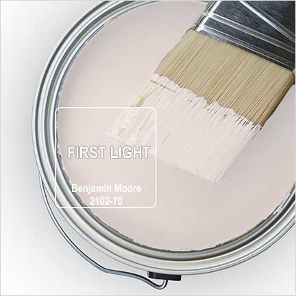
Conclusion: Benjamin Moore has named this light pink �First light� - and it's "The Color of the Year 2020".
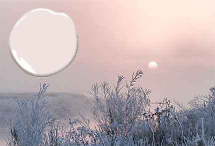
If ever there were a way for pink to shed its sweet, floral, and child-like associations, this does it. On the other hand, what is the color of first light? If you google it you�ll find images like the one below: In any event, it�s all in the name and this one is genius.
Here�s how it looks in the context of nature:
#2 - A subtle green
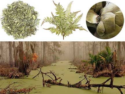
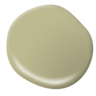 This is a tricky one. It�s a very subdued light green. Sage? Or perhaps the color of a cooked artichoke or a murky swamp? It�s definitely earthy.
If you google sage, artichokes and swamp, you�ll find images such as these:
If you had to reinvent this color with a name that would get rid of all these associations � and have mass appeal � what would you name it?
Consider this: Some paint brands have named a similar shade of this hue �Canary Grass� (Glidden), �Soft Fern� and �Tree Moss� (Benjamin Moore), �Clary Sage� (Sherwin Williams), and Prairie Sage (Glidden).
Pause for a moment. It�s your turn to name it. Try not to use any reference to vegetation or food. (Also, please post it on the Color Matters Web Forum. If you're not a member, we'll approve you immediately.)
. . . . . . . . . . . . . . . . . . . . . . . . . . . . . . . . . . . . . . . . . . . .
Conclusion: Behr has named this subdued green �Back to Nature� - and it's "The Color of the Year 2020".
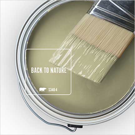
The name embraces nature in general � and that�s a good thing if you find the term �sage� too common or if you don't like artichokes, olives, or over-ripe avocados. As for interiors, it�s a subtle paint color that serves as a perfect backdrop for a room that evokes the peace of nature.
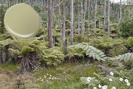
Here�s how it looks in the context of nature:
 A message from Color Matters
Here�s the breaking news about all the "Colors of the Year 2020".
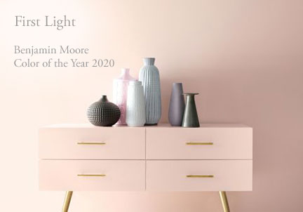
�First Light� (2102-70) is Benjamin Moore's "Color of the Year 2020". It�s a soft airy hue � not too sweet. The brand describes it as �a backdrop for a bright new decade�. Worth noting is that pink has become more of a mainstream color thanks to Millennial Pink. In this case, you might consider �First Light� as the new white. It�s blooming with potential!

"Naval" (SW 6244) is Sherwin Williams� "Color of the Year 2020". It brings navy blue into a new era. The company describes it as a deep shade that �fuses the striking and bold opulence of Art Deco with the awe?inspiring power of nature�. Naval was designed to do just that, inspiring a sense of "restfulness and tranquility" in one's home, according to a press release.
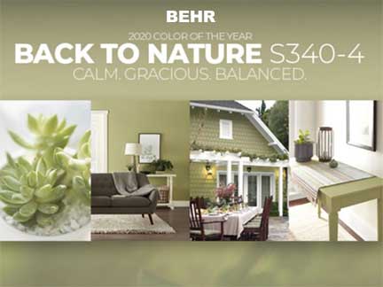
Behr released �Back to Nature� as its "Color of the Year 2020" in mid-August. It�s a meadow-inspired light green hue that the brand describes as "calm, gracious, and balanced, and a way to bring the outside in.� Look closely at this complex color. It�s a very subdued olive green. Murky and peaceful.
"Chinese Porcelain" - PPG
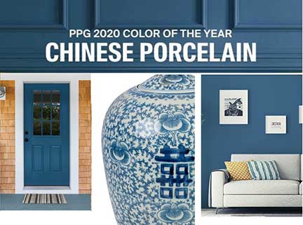
PPG proclaimed "Chinese Porcelain" as its "Color of the Year 2020" in June. It�s described as a blend of cobalt and moody, ink blue that imparts calmness and restful sleep while also offering the spirit of hopefulness � a rare commodity in a restless world.�
Glidden announced it�s not announcing a "2020 Color of the Year". As a matter of fact, this is the brand�s official breakup letter with "Color of the Year" selections. Glidden wants to help do-it-yourselfers and procrastinators get rolling on the paint projects they�ve been putting off by cutting ties with trends and simplifying the color selection process. (Editor's note: Cheers! Point well taken.)
Most interior designers feel grey is on its way out. We�re tired of those stark and simple greys - and color is coming back. Read more at Forbes.
The Big Money Behind Naming a �Color Of The Year�
It�s worth noting that naming a "Color of the Year" is good for business. It�s a simple and inexpensive way to boost traffic and sales. Check out this interesting article from Jude Stewart.
A message from Color Matters
Would you prefer that your home or workplace be colorful or full of color? Make it happen with one of these easy courses from Color Matters: Foolproof Color Formulas for Interior Design or Color Harmony for Your Home.
We�re the folks who are sending this newsletter. Explore the downloadable e-books, e-courses, and web sites from Jill Morton.
Color Voodoo Publications
https://www.colorvoodoo.com
Color Matters E-Courses
https://colormatters.thinkific.com
Color Matters
https://www.colormatters.com
Color Matters Web Forum
Ask anything you'd like to know about color � or share anything that inspires you. It's an invitation only group. We'll approve you immediately.
Color Matters on Facebook
Stay in touch with color more often! Follow us on Facebook and get the latest blast of color. We're posting several times a week.
Colorcom � Color Consultants
https://www.colorcom.com
You're receiving this email because you�ve subscribed to the newsletter or you�ve who expressed an interest in color and Color Matters online courses. You can unsubscribe by clicking "Unsubscribe" on the bottom of every email.
Hello colorful people,
Orange and black are ruling the color wheel and spooky pictures are popping up all over the place. In the spirit of the times, here�s an assortment of creepy and awesome news and images.
Head to Hayden Zezula on Twitter (August 21 & 30 tweet) or his website to explore his three dimensional world of perfectly looped mutant humans, gravity defying objects, and various other hypnotizing geometric arrangements. Most of his animations are so beautiful that they lose their creepiness. Perhaps the slow pace of the images has a lot to do with how we perceive beauty or fear.
Beware of these amoebas lurking in fresh water, hot springs, or improperly chlorinated pools. Scientists explain: �They have these food cups on their surface, which are like giant suckers. They�ll just start eating the brain.�
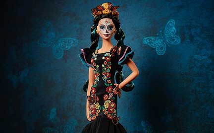
A new collectible Barbie doll � "The Day of the Dead Barbie" (�Dia de los Muertos�) � was recently released to celebrates the annual Mexican festival, in which people honor their departed loved ones.
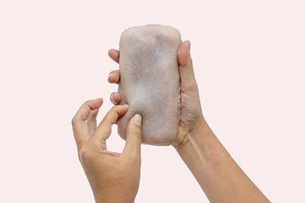
Creepy human-like skin makes your phone ticklish and pinchable. It may seem creepy at first - but the artificial skin is programmed to associate different gestures with certain emotions. Sudden hard pressure on the skin is associated with anger and tapping is a means of seeking attention, while sustained contact and stroking are associated with providing comfort.
Are black and red are the most fearsome colors?

Unlock the keys to killer color psychology for everything else.
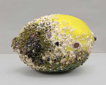
Thousands of gemstones and beads went Into these moldy fruit sculptures.

"Treat Or Treat" ice cream is literally pitch black and full of candy. It looks kind of like an ice cream version of a Worms �N Dirt dessert, minus the gummy worms and sprinkled with m&ms.
Island of the Dolls

La Isla de las Mu�ecas ("The Island of the Dolls") in Xochimilco Mexico is an island covered with decaying old dolls strung up in trees. It's pretty creepy on its own and it's dark past will give you the willies. Check it out.
Also: 45 Abandoned Places Around the World That Are Eerily Beautiful
We�re the folks who are sending this newsletter. Explore the downloadable e-books, e-courses, and web sites from Jill Morton.
Colorcom � Color Consultation
https://www.colorcom.com
Color Voodoo Publications
https://www.colorvoodoo.com
Color Matters E-Courses
https://colormatters.thinkific.com
Color Matters
https://www.colormatters.com
Color Matters Web Forum
Ask anything you'd like to know about color � or share anything that inspires you. It's an invitation only group. We'll approve you immediately.
Color Matters on Facebook
Stay in touch with color more often! Follow us on Facebook and get the latest blast of color. We're posting several times a
You're receiving this email because you�ve subscribed to the newsletter or you�ve who expressed an interest in color and Color Matters online courses. You can unsubscribe by clicking "Unsubscribe" on the bottom of every email.
Hello Andrew,
The season of joy is fast approaching. Soon we�ll be drenched in red and green. But before we do, here�s some news about all the other colors of the spectrum.
T-Mobile�s parent company, Deutsche Telekom, is suing Lemonade, a New York-based insurance provider, because they dared to use the magenta in its ads in Germany. Deutsche Telekom says it owns the legal rights to the shade. Technically, they only own it in connection with the telecommunications industry. US Trademark law is very specific. Nevertheless it shows the extent to which mega-corporations can use the legal system to snuff out perceived threats, regardless how frivolous. (More: Color & Trademarks Who owns hues?.)
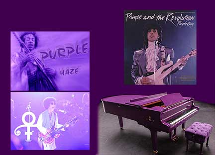
In the meantime, Prince�s estate is struggling to register Prince�s particular purple hue � Pantone�s Love Symbol #2 - for use in connection with �musical sound and video recordings� and �entertainment services�. The USPTO is concerned that this usage is too broad. For example, if the color purple appears on stage during performances or purple doors on dressing rooms - these would be banned if the trademark were granted. In short, Prince�s agents are essentially attempting to protect an array of individual trademarks by way of one application � which is not allowed.
A message from Color Matters
We�re developing an online course about how to use color for brand identity and logos. Let us know if you�d prefer a short 2-hour course or a long one. What price? Just hit reply from this newsletter. We�d love to hear from you. Oh, and while you�re at it, what would you name the course? Thanks! (See existing courses at Color Matters E-Courses)
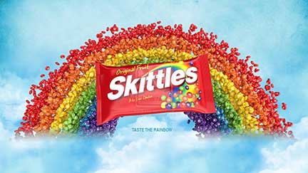
Skittles just reported the results of a survey of 2,000 adults to find out what color they prefer. According to the findings, only 6% of Skittles eaters favor yellow. In non-color-related findings, nearly half (49%) of those surveyed eat Skittles by the handful, while 31% grab a few at a time, and 20% eat only one at a time. The survey also provided some insights into the lives of those who prefer certain color Skittles.

People who live farther away from the equator �or in rainy climates equate yellow with happiness. Those who live closer to the equator don�t equate yellow with joy as much. For example only 5% of people in Egypt associate yellow with joy and in chilly Finland it was 87%. In the United States, with its moderate climate, people's yellow-joy association levels were between 60% and 70%.
What�s your color of joy? Take the Global Color Survey and tell us.
Our sponsor
Color Consultation
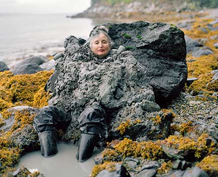
Senior citizens wearing garments fashioned from their natural surroundings. The dignity, the joy. It�s lovely!
In direct contrast to this, here's another view of humans:
Should we merge with machines to expand our intelligence and extend life? The YouTube documentary �I am Human� reveals more about the future.
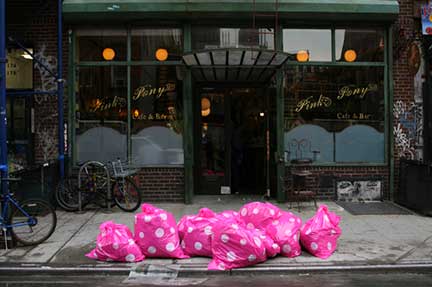
A project called "Trash: Any Color You Like", placed vibrant, polka-dotted trash bags around the streets of New York City. When you see mounds of hot pink trash bags piled on a curb, it offers a striking, yet not aggressive, reminder to be less wasteful. On the other hand, the usual black plastic bags blend into the cityscape and the consequences of our disposable culture become almost invisible.
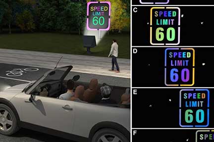
New technology from China can help drivers notice things. Covering road signs with a color-changing transparent film causes signs to reflect in an attention-getting rainbow of changing colors.
We�re the folks who are sending this newsletter. Explore the downloadable e-books, e-courses, and web sites from Jill Morton.
Color Voodoo Publications
https://www.colorvoodoo.com
Color Matters E-Courses
https://colormatters.thinkific.com
Color Matters
https://www.colormatters.com
Color Matters Web Forum
Ask anything you'd like to know about color � or share anything that inspires you. It's an invitation only group. We'll approve you immediately.
Color Matters on Facebook
Stay in touch with color more often! Follow us on Facebook and get the latest blast of color. We're posting several times a week.
Colorcom � Color Consultants
https://www.colorcom.com
You're receiving this email because you�ve subscribed to the newsletter or you�ve who expressed an interest in color and Color Matters online courses. You can unsubscribe by clicking "Unsubscribe" on the bottom of every email.
Hello Andrew,
Black Friday just got more colorful. It won�t get any better than this: 50% off of �The Psychology of Color Symbolism" online course. Grab it now and start mastering color for $124.50. Click here .
Note: The link is programmed to automatically give you the discount! It�s good from today until December 1.
Black Friday could just be the beginning of your adventure with color.
Thanks again for your interest in Color Matters online learning!
Jill Morton
You're receiving this email because you�ve subscribed to the newsletter or you�ve who expressed an interest in color and Color Matters online courses. You can unsubscribe by clicking "Unsubscribe" on the bottom of every email
Hello Andrew,
It's the season of joy � a time to celebrate color and to wish all of you a Merry Christmas and a Happy New Year.
Pause for a second and consider this question: Who does beautiful color better, nature or humans?
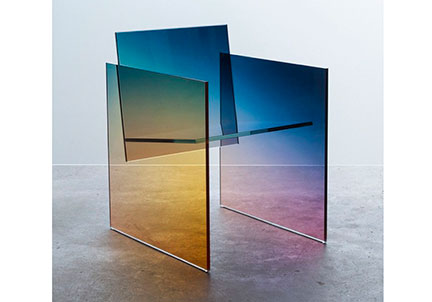
Created by Latvian-born designer Ermi?s, this chair is included in the list of "21 of the Most Beautiful Designs in the World."
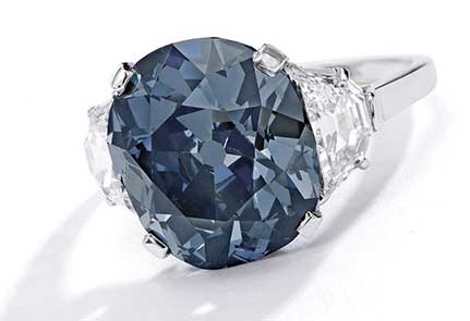
A fancy colored diamond, known as �The Indian Blue,� sold for $6.6 million at Sotheby�s jewelry auction last week in New York. The 7.55-carat deep grayish blue diamond is mounted on a ring flanked by two shield-shaped diamonds.
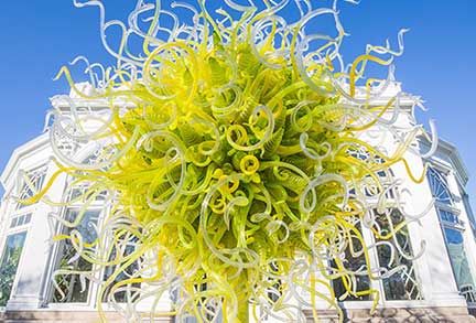
Chihuly creates masterpieces of blown glass. He draws inspiration from the world around him, creating statements using color and form to capture the imagination, and catapult beyond conventional ideas of function and beauty.

There's no snow in the tropics during the Christmas season, but the glory of divine colors is awe-inspiring. Watch the video for a panoramic view that spans the shoreline on the North Shore of Oahu, Hawaii
Obsidian is dense volcanic glass and typically black in color. The multicolored iridescence is often formed when the lava cools so fast that crystals do not have time to grow. This unique glass can be found at the Rainbow Mine and Middle Fork Davis Creek in northern California.
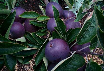
These amazing apples owe their color to their native geography. They grow in a small city in the mountains of Tibet, where they receive a lot of ultraviolet light during the day but the temperature fluctuates dramatically at night. This causes the skin to develop a deep, dark color.
A message from Color Matters

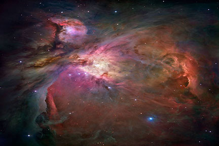
13.8 billion years ago there was one color that appeared before all the others � the first color of the universe. The big bang was an expanding space filled with energy but temperatures were so high that light (and color) didn�t exist at first. After 380,000 years of cooling, the glow of light could be seen. If we could go back to the period of that first light, we would probably perceive an orange glow similar to firelight.

Chapman Taylor ?challenged their employees to look 60 years into the future, to 2079, & the possibility of a human colony on Mars. Check out the winners of the 2019 Design Competition.
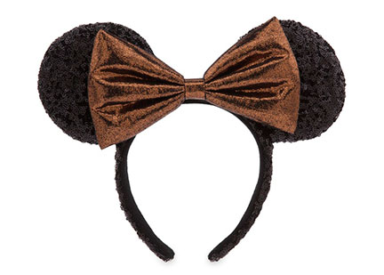
�Belle of the Ball� Bronze was just announced as the next Disney color trend. This new collection features dark hues of golden bronze, black, and metallic, all meant to emulate Belle from Beauty and the Beast. Check out the collection of hoodies, leggings, headbands and other treats. It�s igniting the Instagram crowd.
Celebrate the season with a powerful pink. It�s "Sizzle" from CMG�s Color Alert. They say it hovers between hot pink and fuchsia � which raises the question, "What's the difference between these color terms?" I found this explanation.
We�re the folks who are sending this newsletter. Explore the downloadable e-books, e-courses, and web sites from Jill Morton.
Color Voodoo Publications
https://www.colorvoodoo.com
Color Matters E-Courses
https://colormatters.thinkific.com
Color Matters
https://www.colormatters.com
Color Matters Web Forum
Ask anything you'd like to know about color � or share anything that inspires you. It's an invitation only group. We'll approve you immediately.
Color Matters on Facebook
Stay in touch with color more often! Follow us on Facebook and get the latest blast of color. We're posting several times a week.
Colorcom � Color Consultants
https://www.colorcom.com
You're receiving this email because you�ve subscribed to the newsletter or you�ve who expressed an interest in color and Color Matters online courses. You can unsubscribe by clicking "Unsubscribe" on the bottom of every email.
Happy New Year!
Do new colors and design trends start with dusting off old ones?
So it seems. Pantone selected �Classic Blue� as its Color of the Year 2020 to usher in the next decade. They describe it as a �reassuring presence� in these troubled times, and as a symbol of �protection, stability, peace, and confidence, as well as encouraging deep thinking, open mindfulness and communication". That�s a lot of symbolism � but it embodies Pantone�s efforts to make the color socially relevant for the year ahead.
As expected, reactions to any "Pantone Color of the Year� are mixed. Last year�s �Living Coral� was blasted for NOT symbolizing our natural surroundings (a healthy ocean). Instead, it reminded us of the dying coral reefs. But this year it's blue - one of the world's favorite colors.
Here we go again. Is "Classic Blue" a color that you can rely on in the New Year � or did Pantone miss the mark?
�Classic Blue� is a deep shade of blue � a bright navy or the color of new denim. Although it�s different from other COTY colors in years past, some see this blue as humdrum and dull instead of Pantone�s description of timeless simplicity, comfort, dependability, and stability. As they said, �It�s a color that you can rely on.�
�Classic Blue� is forgettable, pedestrian and safe. It�s vanilla and better off as white noise background chatter. This color is an odd choice because in recent years, Pantone has taken pains to make its Color of the Year culturally relevant. On that note, the hue calls to mind Facebook�s logo and the Google Docs icon. A vivid blue reminder of data surveillance and work doesn�t exactly soothe the soul with a �reassuring presence".
Comments:
�Ehhhhhh a slightly darker shade of Facebook blue is not super inspiring.
Classic blue? More like corporate blue. It�s already used by brands like Pepsi, Ford, Facebook and Visa.
Pantone played it safe because blue is one of the Western world's eternally favorite colors � no doubt because it instantly recalls cloudless skies and calm seas. It couldn't go wrong with such an inoffensive pick. Or could it? Despite all the positive sea and sky symbolism it's also associated with sadness, blue movies, and politics.
Editor's comment: Maybe it�s a good thing that blue may not generate a consumer rush to purchase something in the �hottest� hue for 2020. Consider this: Blue is the favorite color of most people in the world. You probably already have a good stash of blue clothes and maybe even towels, sheets or other gadgets. That�s what upcycling is all about. Creative reuse for 2020. We can thank Pantone for that.
The controversy is good because it calls attention to how colors can mean many things to many people. There�s no �one color fits all� symbolism theory.
The Psychology of Color Symbolism" online course covers everything you'll ever need to know about every color of the spectrum.
Start your new year off right with the power of color. Learn online at your own pace.
Trends
It�s heavy, it�s ornate and it�s filled with excess. Victoriana is creeping into vogue. Three formerly unpopular decor styles are merging into one big design trend. As is the case with �Classic Blue�, could we just be dusting off old colors and trends?
A collection of colorful pictures taken in Bali with a converted camera.
Photographic motion and light paintings created by LED light sticks attached to kayak and canoe paddles.
We�re the folks who are sending this newsletter. Explore the downloadable e-books, e-courses, and web sites from Jill Morton.
Colorcom � Color Consultants
https://www.colorcom.com
Color Voodoo Publications
https://www.colorvoodoo.com
Color Matters E-Courses
https://colormatters.thinkific.com
Color Matters
https://www.colormatters.com
Color Matters Web Forum
Ask anything you'd like to know about color � or share anything that inspires you. It's an invitation only group. We'll approve you immediately.
Color Matters on Facebook
Stay in touch with color more often! Follow us on Facebook and get the latest blast of color. We're posting several times a week.
You're receiving this email because you�ve subscribed to the newsletter or you�ve who expressed an interest in color and Color Matters online courses. You can unsubscribe by clicking "Unsubscribe" on the bottom of every email.
Hello Andrew,
Time to fess up. I watch TV. A lot of TV, Netflix and movies. Actually, it�s part of my job as a color consultant to stay in touch with contemporary culture and watch the parade of colors that influence us. With that said, the Grammy Awards on Sunday night delivered beyond one�s wildest imagination � and at the same time it honored the great Kobe Bryant.
It�s not often that an awards show begins with a truly show stopping performance - and Lizzo delivered in a sparkly dress that looked like the night sky and accompanied by an orchestra of women. Watch the video for all the moves and all the colors.
At 18 years old, Billie Eilish is known for her �luxury meets loungewear� look. She continued this at the 2020 Grammys with her custom Gucci monogrammed matching set in neon green and black, but also took the monogrammed theme a step further with matching green Gucci-logo nail art.
This star-studded genre-crossing performance is worth every second of time to watch. It transitions from lime green to neon pinks � from BTS to Billy Ray Cyrus.
Grammy Awards 2020: The performances ranked, from best to worst
Billy Porter wore a head-turning wide-brimmed turquoise blue hat with a remote-controlled privacy screen of crystalline fringe at the Grammys � but there�s much more about this artist. He�s won a Tony, a Grammy and a Golden Globe award. At age 50, Billy Porter is a fashion trailblazer of the most outrageous kind. He explains that �flamboyant� was a word that was used to marginalize him and kept him in a box. He broke free.
It�s a big change from the goofy style of the past. GoDaddy�s new logo is a streamlined, curvy expression of corporate values such as Airbnb�s logo (which evokes an upside-down heart.
A message from Color Matters
I've been working on an online course about color and branding for 4 months now and I'm trying to keep it to a short 2-hour course at an affordable price ($99.00 - $149.00). Would love to hear from you about what you'd like to learn in a course devoted to logos and visual identity. Just hit reply on this email.
Say hello to Butterscotch, the new orangey-yellow color just added to the Fiesta dinnerware palette. It�s the 52nd Fiesta color to be introduced since the brand was launched in 1936.
Just when you thought the COTY proclamations ended with Pantone and paint companies in December, there�s more: Axalta unveiled �Sea Glass� as the 2020 Global Automotive Color of the Year. It�s a shimmering shade of turquoise blue that�s expected to set a trend as a fresh new color meant for all vehicle types.
The results of the migraine study by Dr. Mohab Ibrahim aren't published yet. But they build on a small but growing body of research suggesting a link between green light and pain. He states that on average, people experienced a 60% decrease in the intensity of their migraines and a drop from 20 migraines a month to about six.
In memoriam: Kobe Bryant
The Empire State Building paid tribute to Kobe Bryant with purple and gold lights, the colors of Los Angeles Lakers. May he and the 8 others who died in the crash rest in peace.
We�re the folks who are sending this newsletter. Explore the downloadable e-books, e-courses, and web sites from Jill Morton.
Colorcom � Color Consultants
https://www.colorcom.com
Color Voodoo Publications
https://www.colorvoodoo.com
Color Matters E-Courses
https://colormatters.thinkific.com
Color Matters
https://www.colormatters.com
Color Matters Web Forum
Ask anything you'd like to know about color � or share anything that inspires you. It's an invitation only group. We'll approve you immediately.
Color Matters on Facebook
Stay in touch with color more often! Follow us on Facebook and get the latest blast of color. We're posting several times a week.
You're receiving this email because you�ve subscribed to the newsletter or you�ve who expressed an interest in color and Color Matters online courses. You can unsubscribe by clicking "Unsubscribe" on the bottom of every email.
Happy Valentines Day,
It's the season for love - and I hope that this newsletter gives you inspiration to love color even more.
Ladies and gentlemen, if you could have a rose in any color, what color would you choose? Pink, red, black, teal green or ...?
Here's a twist: What color would you turn down � if any?
I surprised myself when I turned down a dark red rose from a greeter at a church service last week. He replied, �That's the first time I've ever been turned down!" But there�s more to it than this simple description. I had noticed that someone else was handing out pink and orange roses behind him and to the right. Given the option, I turned him down and grabbed a salmon orange rose from the other greeter. It was worth a laugh � but it reminded me of how complex our color preferences are. In this case, it's not the color per se. I love dark red wine! It's just how dark red makes a rose look so dead to me. And so, I ask what color would you turn down?
This heart appears to be pulsating and emitting something. More from Akiyoshi Kataoka on Twitter
Color Extravaganza
Here�s some news about some outrageous and extravagant colors in the news.
Richard Mille�s RM 56-02 is a watchmaking milestone of technical achievement � a baseplate created from grade 5 titanium and third wheel additionally created from sapphire � and a price tag of $2.5 million.
Superstar Jennifer Lopez added a touch of glam to her Starbucks cup. Surely it�s proof that she carries her dazzle beyond her performance at the Super Bowl halftime show. Check out TaylorMade Bling for phone cases, license place covers, and much more that you can customize for your style of bling.
A message from Color Matters
Embrace color like never before.
The trend of combining two different hues or fabrics on a single garment has taken on new momentum. Vivid color combinations have been dominating the red carpet at the Grammy and SAG awards. Case in point: Red and pink. Cynthia Erivo's dress features a vibrant red bodice followed by a voluminous pink bottom and long train. This trend is here to stay.
Emerald cabinetry, purple backsplashes, and turquoise ceilings! Anything but white, because the revolt against the white kitchen has begun. Think bold and bright to inject a new energy. After all, who doesn�t want the nourishment of a colorful kitchen?
See the best looks that writers, influencers, stylists and designers wore to the shows and why they decided to wear it. Scroll down through the pics and check out Michelle Palacios Huynh.
Who doesn�t love a great optical illusion?
British tile company Casa Ceramica have designed a novel optical illusion flooring system that uses real tiles to create a vertigo-inducing warped floor.
Do they appear to move? Or maybe wobble? From Akiyoshi Kataoka on Twitter.
We�re the folks who are sending this newsletter. Explore the downloadable e-books, e-courses, and web sites from Jill Morton.
Colorcom � Color Consultants
https://www.colorcom.com
Color Voodoo Publications
https://www.colorvoodoo.com
Color Matters E-Courses
https://colormatters.thinkific.com
Color Matters
https://www.colormatters.com
Color Matters Web Forum
Ask anything you'd like to know about color � or share anything that inspires you. It's an invitation only group. We'll approve you immediately.
Color Matters on Facebook
Stay in touch with color more often! Follow us on Facebook and get the latest blast of color. We're posting several times a week.
You're receiving this email because you�ve subscribed to the newsletter or you�ve who expressed an interest in color and Color Matters online courses. You can unsubscribe by clicking "Unsubscribe" on the bottom of every email.
Greetings,
You won't believe your eyes and your nose won't believe what your eyes see. There's a lot of breaking news in the world of color and design.
The scent of colors
McDonald''s is releasing a six-pack of scented candles that will smell like your favorite burger ingredients: the bun, ketchup, pickles, cheese, onion and beef. When burned together, they'll smell like a Quarter Pounder. Individually, you can indulge in the smell of a pickle or whatever you desire. The candles were created to celebrate the burger''s nearly 50-year run. Read more.
Kentucky Fried Chicken teamed with Crocs for a chicken bucket sandal. These special edition rubber sandals come with a chicken-leg-shaped Jibbitz charm that look and smell like fried chicken.
Worth noting is that this shows how brands are fighting for your attention. The challenge for brands to break through all that noise is clear. No longer is it enough to produce a well-conceived, perfectly executed commercial or ad.
Pantone added the smell of "Classic Blue" when they announced this hue as their "Color of the Year". They describe the scent as "a fragrant contemplation of where sky and sea meet" - and created a scented candle for the sensory experience. Perfumer Ashley Balavoine describes it as "notes of water and sea salt lifted by airy sky, in accord with notes of fluffy cloud with water lily and seaweed absolute, followed by bottom notes of blue musk, minerals and ocean timber." It's worth noting that they also offered blue drinks and a blue jelly as the taste of blue. It's a great example of the multisensory experience of colors.
A message from Color Matters
Learn how color affects all your senses for the most powerful impact in all your designs.
Pick the fast and easy online course that works best for you: The Psychology of Color Symbolism or Foolproof Color Formulas for Interior Design
Color trends - such as Pantone's "Color of the Year" - actively shape the colors designers incorporate into their products in the years to come. As a result, the fashion industry is making more clothes to keep pace with the need for clothes that are aesthetically different from previous seasons. All of this has sent us into a state of massive overconsumption.
Note: Most of us have about 150 items in our closet. I dare you to count what's in your closet. I did and I was horrified.
From "Birds of Prey" to "Wonder Woman 1984", a riot of color is transforming comic-book movies. And it's not just more vibrant colors - but neons and golds. A more colorful era of comic-book movies is replacing the dark and drab hues from the past.
Penda has developed a concept for a wearable shield, which could be deployed at the mass scale during epidemics. It's a hazmat suit for the urban commuter. So, what''s the color symbolism? Orange is the color code for biohazard. But what about purple?
Olga Alexopoulou just invented a new hue called Quantum Blue in collaboration with Berkeley Lab chemists. The color is a result of her quest to pin down a shade of blue she describes as the so-called blue hour, "that brief period of twilight before sunrise or after sunset, when the blue of the sky seems like it has an otherworldly glow." The high-tech pigment consists of particles of phosphor absorb UV light and convert it to a different wavelength (or fluoresce). The result is a pure, radiant blue like one might see at dusk.
The Smithsonian Institution has released 2.8 million images from copyright restrictions on its site, Smithsonian Open Access. Visitors to the website can download and use the files in whatever way they wish without requesting express permission from the organization.
An infographic from "Lovely Roses" illustrates the different meanings and appropriate times to use roses. It's an interesting analysis that you may or may not agree with. For example, are ivory roses symbolic of enchantment? On the other hand, roses are a nice way to say what's on your mind without words - for example the friendship and joy of yellow. The website has some good tips for other topics such as methods of preserving or drying flowers.
We're the folks who are sending this newsletter. Explore the downloadable e-books, e-courses, and web sites from Jill Morton.
Colorcom - Color Consultants
https://www.colorcom.com
Color Voodoo Publications
https://www.colorvoodoo.com
Color Matters E-Courses
https://colormatters.thinkific.com
Color Matters
https://www.colormatters.com
Color Matters Web Forum
Ask anything you''d like to know about color - or share anything that inspires you. It''s an invitation only group. We''ll approve you immediately.
Color Matters on Facebook
Stay in touch with color more often! Follow us on Facebook and get the latest blast of color. We''re posting several times a week.
| Data Name | Data Type | Options |
|---|---|---|
| First name | ||
| Email address |
Stay in touch with the latest news about color. Subscribe to the Color Matters bimonthly newsletter.
Success! Now check your email for the link to download "The 3 Most Common Color Mistakes & How to Fix It."
 Arts and Entertainment
 Business and Industry
 Computer and Electronics
 Games
Games Health
 Internet and Telecom
 Shopping
 Sports
 Travel
 More
More