This site did not show evidence of storing passwords in plaintext.
This site does allow secured connections (https)
This site did show a clear way to unsubscribe from their emails
This site does verify your email address.
Membership Emails
Below is a sample of the emails you can expect to receive when signed up to Flourish.
Welcome to Flourish! You're all set. Three tips to get you started:
1. Make your first visualisation. Learn to create a Flourish visualisation.
2. Tell your story. Flourish stories let you show the highlights in your data, just like a presentation. Create a Flourish story.
3. Share what you've built. It's easy to publish and share - responsive embeds mean your visualisation looks great on any size screen.
Make a visualisation now
Need help? Just reply to this email
We'd love to hear from you
Copyright � 2019 Flourish, All rights reserved.
You are receiving this because you registered interest in data visualization platform Flourish
Our mailing address is:
Flourish
Studio G06
16 Baldwin�s Gardens
London, EC1N 7RJ
United Kingdom
Add us to your address book
Want to change how you receive these emails?
You can update your preferences or unsubscribe from this list.
How to choose the right visualisation for your data
Hi there,
Thanks for signing up to Flourish! This is the second of three emails we�ll send you about getting started.
First up: some tips on how to choose the right visualisation for your data.
This is a question we�re often asked. The choice can feel overwhelming - but narrowing it down is straightforward.
[Just want to get started quickly with Flourish? See our three-minute getting started guide.]
The one question that will help you choose the right visualisation
What is your data trying to communicate?
The Financial Times has made a great visual vocabulary for choosing visualisations. We�ve borrowed their categories to help you pick the right visualisation.
1. Change over time
If you mainly want to communicate change over time, use these. Click to make one now!
Line: The standard way to show changing time series
Area: Great at showing total change, though individual series are less clear
Column: Another way to show change over time, especially for a single series
Slope: Good for clearly conveying �before and after� data
2. Size
Use these when you mainly want to communicate size comparisons, relative or absolute.
Column: The standard way to compare the size of things; y-axis should always start at 0
Bar: Like columns, especially when the data are not time series, or axis labels are long
Grouped column: As per column, but for multiple series
Grouped bar: As per bar, but for multiple series
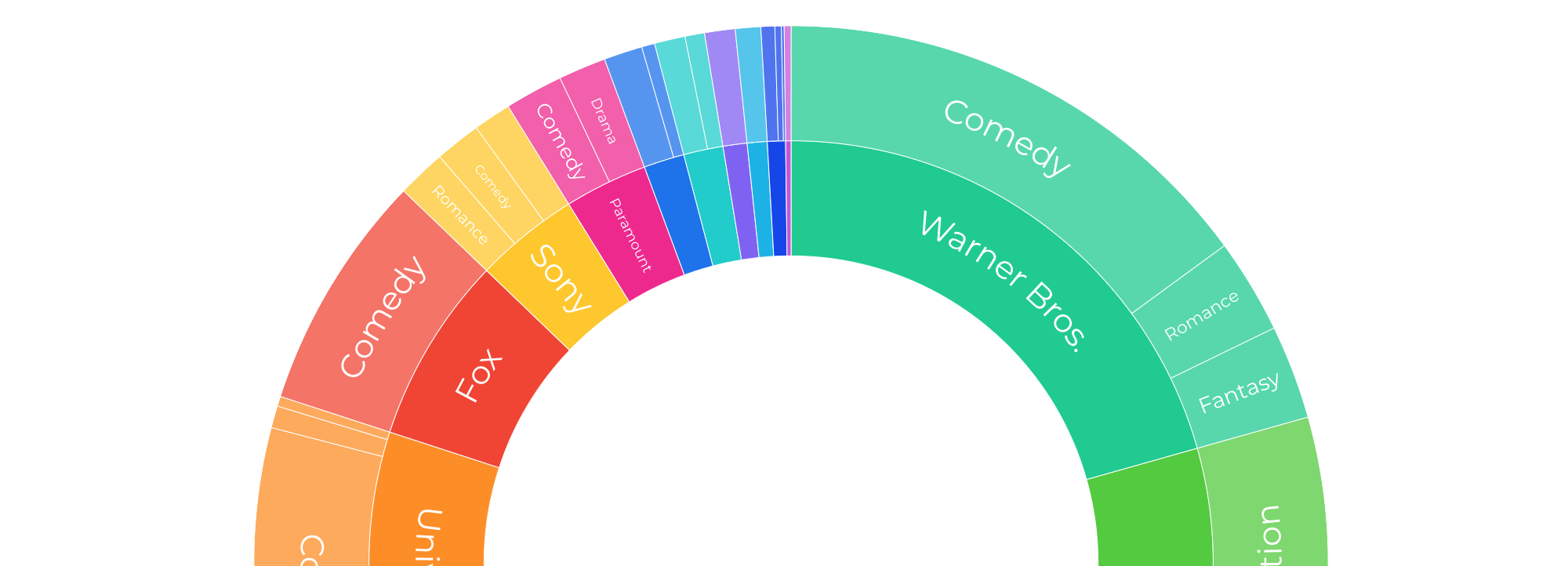
3. Parts of a whole
Use these to show how an entity breaks down into its components. (If you�re mainly interested in the absolute size, consider a size chart instead.)
Pie: Common, though hard to accurately compare the segments
Donut: Similar to a pie, though the centre can be used to convey additional information
Stacked column: Good for combining with change over time, though can be hard to read
Treemap: Use for hierarchical part-to-whole relationships
Sunburst: Attractive alternative to treemap, though may be harder to read
Packed circles: Attractive alternative to treemap, though may be harder to read
4. Correlation
Use these to show the relationship between two or more variables.
Scatterplot: The standard way to show the relationship between two continuous variables
Bubble chart: Like a scatterplot, but sizes the circles by a third variable
Connected scatterplot: Aka Rosling chart: show how relationship has changed over time
5. Ranking
Use where an item�s position in an ordered list is the most important thing about your visualisation.
Ordered bar: A simple bar chart. Just order your data as you want it to display
Horserace: Also known as a bumps chart. Show more detailed comparison over time
Slope chart: Perfect for showing effectively how ranks have changed over time
6. Distribution
Show values in a dataset and how often they occur. The shape of a distribution is often useful to see. Coming soon: histograms!
Dot plot: A simple way to show raw values in the data, across categories
Box plot: Summarise multiple distributions by showing the median & range of the data
7. Flows and relationships
Use these to show volume, movement or connections.
Sankey: Show changes in volume between different conditions
Chord: A complex but powerful way to illustate two-way flows
Network: Use to show the strength and connectness of relationships
Directed network: With arrows to show directed relationships
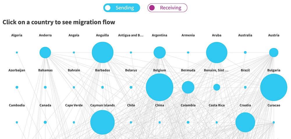
8. Geospatial
Use when geospatial patterns in your data are more important than anything else.
Choropleth: Use with your own GeoJSON data
Icon map: Simple point map, using icons or emojis
Connections globe: Unique way to show flow between countries
9. Flourish special: Election visualisations
This category is specifically for people wanting to visualise the outcome of elections.
Parliament chart: Aka arcmap, often used for election results
Election chart: Searchable bar chart ideal for election results, includes a coalition builder feature
Sankey: Also good for showing voting changes between elections
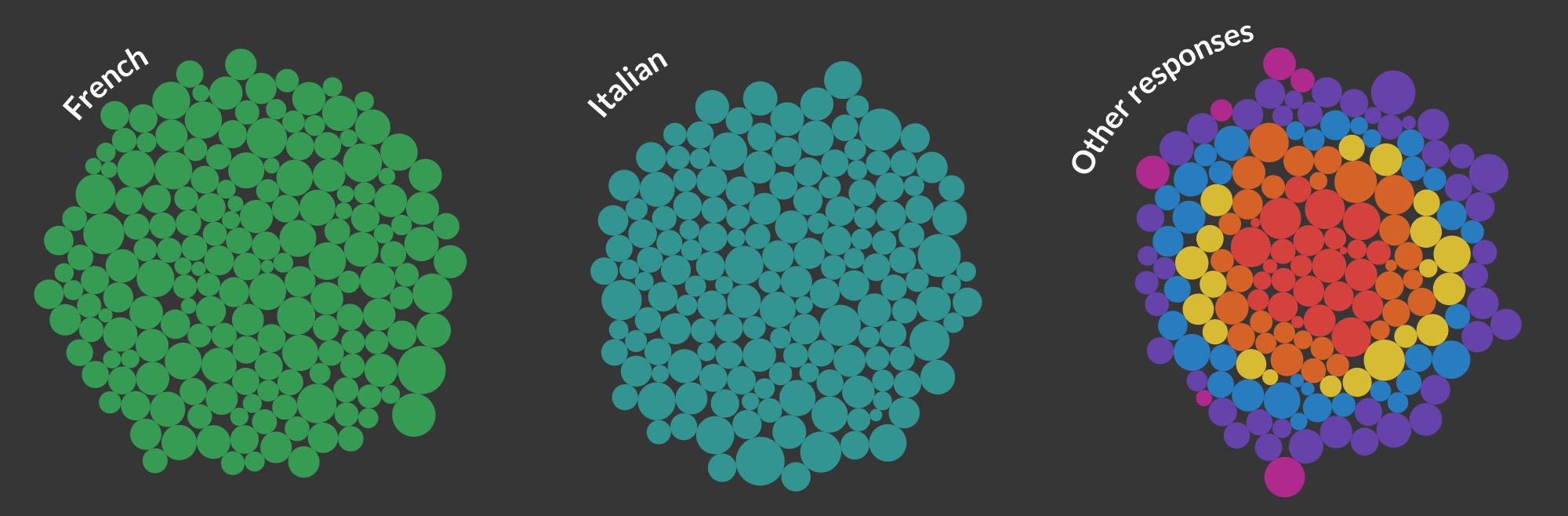
10. Flourish special: Individual users� responses
Another Flourish special! If you have data about individual events or entities, use the Flourish survey visualisation to let your users query your data however they wish.
Survey: Powerful interactive �dot� visualisation, good for exploring survey results
You can choose from all these visualisations, and more, inside Flourish.
Got any questions? Just write back and we�ll answer.
Best wishes,
Duncan & the Flourish team
Flourish, created by Kiln
G06, 16 Baldwin�s Gardens, London EC1N 7RJ
Unsubscribe
How to tell compelling stories with data
Hi there,
This is the last of the emails we�ll send you about getting started with Flourish.
Data is everywhere, but telling effective stories with data is hard. But Flourish makes that easier. Here�s how.
Visualisations get really powerful when you combine them into Flourish stories. Think of these as PowerPoint with superpowers.
Here�s an example:
Flourish stories have slides, captions and images, just like PowerPoint or Keynote. But they have two important differences:
It�s easy to include interactive visualisations.
They�re web-native, so you can embed them on any web page, as well as presenting them live.
Watch the video: learn to make a Flourish story in 30 seconds �
2. Use animation to communicate change
Whatever story you�re trying to tell, it probably involves change. Welcome to your new superpower: using animation to communicate change in stories.
This is a really effective way to get your audience�s attention.
Our brains are hard-wired to follow moving objects like this. So transitions not only look great, they actually make it easier for your audience to follow your story.
To do this, just add slides with visualisations that use the same template, then use the slide editor to change what each slide shows. Your story will �remember� the state of each slide, and automatically animate between them.
3. Add text, images and video
Just like PowerPoint, you can use text and image slides to convey ideas. This is easy with Flourish, and you have plenty of layout options.
You can even add background videos. Coverr has an awesome selection of free clips.
4. Style it your way
Finally, you�ll want to style your presentations your own way - choose from three different navigation styles to make them your own. Business users can also add their own logos, colours and fonts to slides.
Watch the video: make a Flourish story in 30 seconds �
Help page: make a Flourish story �
Got any questions? Just write back and we�ll answer.
Best wishes,
Duncan & the Flourish team
Flourish, created by Kiln
G06, 16 Baldwin�s Gardens, London EC1N 7RJ
Unsubscribe
Hello everyone,
Greetings from an increasingly chilly London. We have a few exciting things to share this week.
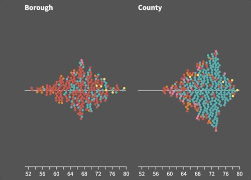
Introducing beewarms, violin plots and WebGL scatters
You can now easily make beautiful beeswarm and violin plots to show distributions in your data. These chart types have been added to our Scatter template, which also now includes a WebGL mode, enabling it to display and smoothly animate tens of thousands of points simultaneously.
� Read the blog post and see the examples
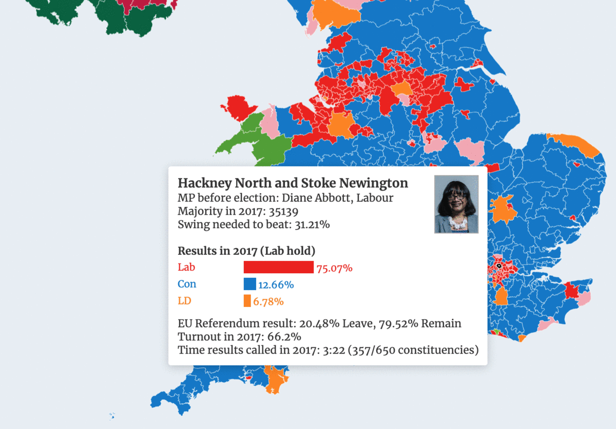
Live maps and charts for the UK election
Calling newsrooms! If you�re covering the UK general election next week, you can make use of our live interactive results maps and charts. We�ll be making these freely available for you anyone to embed, and they will update automatically as results come in.
� UK election maps: make our own or embed our live ones
(Psst � behind the scenes, the maps will use Flourish�s new live data functionality. Yes, you heard correctly! More news on that coming soon.)
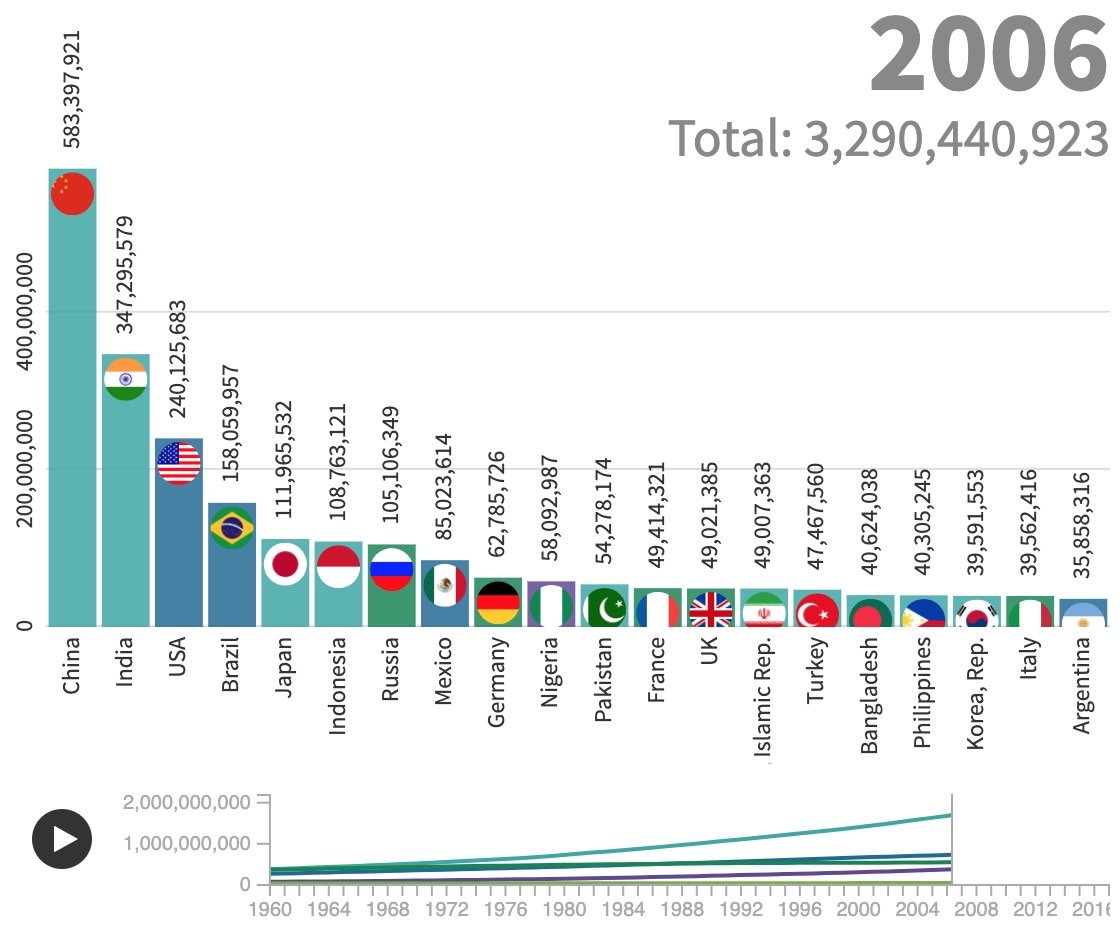
Bar-race time controls, totalizer chart and vertical mode
Lots of you have asked for a time slider control for Bar Chart Race graphics. This went live yesterday! Even cooler, the slider doubles as a mini line chart showing the totals across the dataset. The updated template also offers a vertical bar mode and timed captions with images.
� Try the updated Bar Chart Race template
You asked, we built�
As always, we�ve been busy adding new loads of small improvements based on your feedback. For example, the Line Chart Race now supports �ticking� labels to add dynamism to animations. Parliament charts reveal party names and totals on hover. And the Table template includes text alignment options.
Join our team!
We�re currently looking to fill two exciting roles at our office in London: a Full-stack JavaScript Developer to work across our Node and AWS stack, and a Support Specialist to help our rapidly growing user base be successful.
Share your best Flourish visualization
The next newsletter will include some of our favourite Flourish projects from 2019. Have you made something you�d like us to consider including? Hit reply and send us a link!
Best wishes,
Duncan and the Flourish team
PS. In case you missed it last time:
� Visualize big geo-datasets with the Point map template
� Create content grids and carousels with the new Cards template
� Easily unpivot your data in the Flourish data table
� Line charts now include proper date axis controls
� Add custom continuous colour scales in maps
� The Network template now supports node labels and images
� You can add a custom maps to a Survey template
� Nueve ideas para hacer gr�ficos en elecciones!
Did someone forward this message to you? Join the list!
Flourish, created by Kiln
G06, 16 Baldwin�s Gardens, London EC1N 7RJ
Unsubscribe
Hello everyone,
What an amazing year for the Flourish community. It�s hard to believe that less than 24 months since we launched, we�re counting visualizations in the millions � and views of visualizations in the billions. Thanks to you all for being part of it!
Our data journalist Katie decided to look back at 2019 to remember what happened and to showcase a tiny proportion of the things that you made with Flourish. Take a look � or read the screen grab version below if you�ve clicked enough links for one year :-)
Read the Flourish Year in Review 2019
Have a great break and see you in 2020.
Best wishes,
Duncan and the Flourish team
PS. Come work with us! We currently have technical, commercial and admin jobs open in our London office.
Did someone forward this message to you? Join the list!
Flourish, created by Kiln
G06, 16 Baldwin�s Gardens, London EC1N 7RJ
Unsubscribe
Hi everyone,
This month, we're excited to share two big developments and lots of smaller ones!
Screen reader descriptions
In the world of interactive data-driven content, accessibility is a relatively new field. We're determined to innovate in this area, and we're excited to announce a step on that journey: screen-reader settings to provide a text alternative to visual elements.
. Read about our new accessibility feature
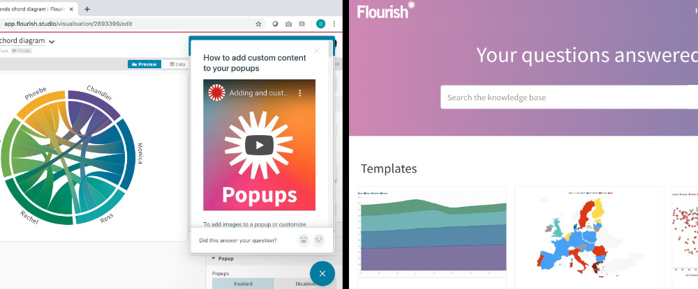
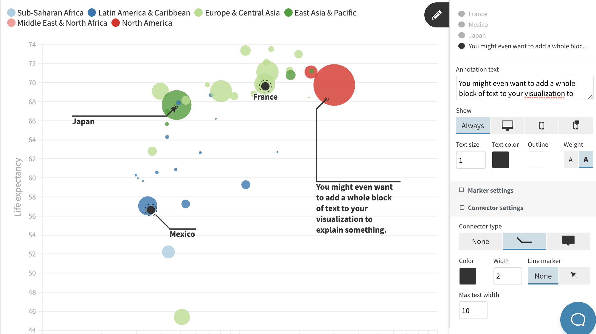
Drag-and-drop annotations
Our new annotations system makes it easy to add labels, connector lines and arrows that display nicely across different devices. The system is now live in our "Line, bar, pie" and "Scatter" templates and we will be rolling it out further in the coming months.
. Annotations: read the blog post
New line labels
We've greatly improved the labels in our line charts. The labels now automatically spread out to reduce overlap. They also offer straight or stepped connector lines. Here's an example from Yahoo! Finance.
. Make a line chart
Region outlines in maps
Our "Projection map" template now supports region groups, which you can use to create state outlines around counties, for example, or continent outlines around countries.
. See other map outline examples in our blog post
Cleaner data tab design
We have simplified the interface of the data area in the Flourish editor. Column settings now appear only for the selected data sheet, and a cleaner design makes it easier to navigate when there are a large number of settings.
. Try the new interface
In the wild: elections and COVID
Thousands of Flourish users created amazing US election visualizations this month, from beautiful scrollytelling pieces to maps using our electoral college hexmaps example. US politics were also featured in a COVID bar chart race by Dan Goodspeed that went so viral people started writing articles about it.
Remove Flourish GA
Published Flourish projects include basic Google Analytics (without cookies). Enterprise customers can optionally now remove this. Contact us to find out more about the Enterprise plan.
Scheduled downtime: 12th December
In order to upgrade our database, we are planning around 30 minutes of scheduled downtime on 12th December at 02:00 UTC. You won't be able to access the editor during this time, but live published projects (including those embedded on other sites) will not be affected.
We're hiring!
We're looking for a talented Software Engineer to join our team. Get in touch or spread the word!
We'll be back in a few weeks with more updates. In the meantime, as always, just hit reply with any ideas, questions or feedback.
Best wishes,
Duncan and the Flourish team
Did someone forward this message to you? Join the list!
Flourish, created by Kiln
G06, 16 Baldwin's Gardens, London EC1N 7RJ
Unsubscribe
Hello everyone,
Apologies for the long gap between emails. We've been super busy with huge COVID-driven increases in users and traffic. But we've also been building features faster than ever, so there's lots to update you on.
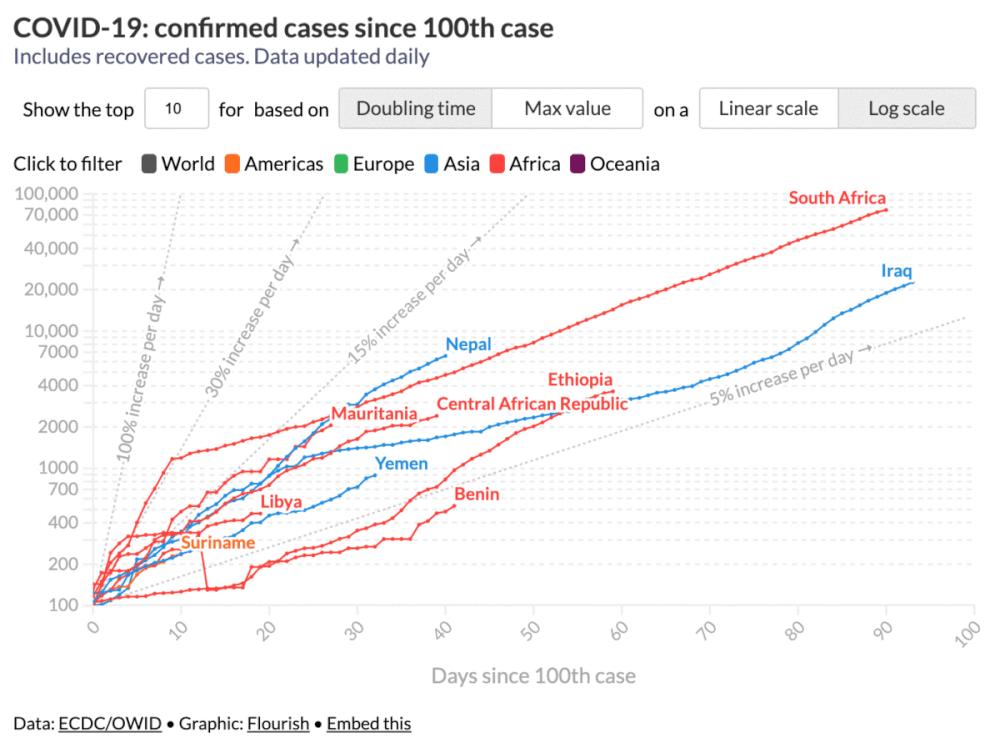
COVID-19 charts
Thousands of you have served billions of coronavirus charts and maps since the crisis began. We also launched our own set of live COVID-19 visualizations, which you're welcome to embed on your own site.
. Free mobile-friendly live covid graphics
New Flourish help docs
We recently launched a rich archive of Flourish help docs. Best of all, you can access these directly from the editor: just hit the big blue help button at the bottom left and relevant docs will appear.
. Browse the new help docs
So many new features!
We've been adding features across all the built-in templates. A few recent highlights.
. Our powerful Scatter template is the first outing for our fancy new drag-and-drop annotation feature. We'll talk more about this in another newsletter when we've rolled it out to more templates.
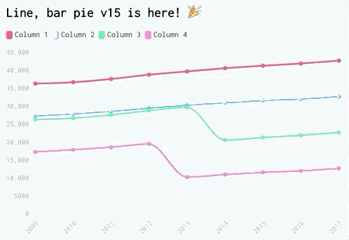
. The "Line, bar, pie" template has better label options, selective dashed lines and better axes which automatically set their own size.
. Our searchable tables are now lightning fast and support mini stacked bar charts with negative numbers.
. The "Hierarchy" template now has more sorting options and an inner radius seting for donut-style radial charts.
. The "Survey" template can now exclude small categories or group them under "Other", which really improves results with many datasets.
. Our popular "Projection map" template now offers editable SVGs for downloads while still using much faster canvas rendering for display online.
. Flourish image and video slides now offer a fixed aspect ratio mode, which is great for video stories.
Community templates
Did you know any developer can create new Flourish templates? Earlier this year we published a Q&A with Code for Africa about their experience creating the "Bubble Network" template.
. Read the Q&A and try the template
New embed domain
If you've ever had to whitelist Flourish domains in your network or website, please also add flo.uri.sh, which is our new domain for published embedded content. We plan to migrate older projects to the new domain in due course. More on that next time.
We always love to hear your feedback and ideas so feel free to press reply!
Best wishes,
Duncan and the Flourish team
Did someone forward this message to you? Join the list!
Flourish, created by Kiln
G06, 16 Baldwin's Gardens, London EC1N 7RJ
Unsubscribe
Hi everyone,
We have lots of updates and other news to share, so let's dive straight in!
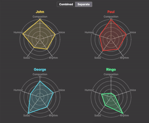
New template: Radar
Our new Radar template is useful for comparing the attributes of people, companies or any other entities. It offers traditional radars plus newer alternatives such as radial bars and "stellar" charts - all with animated filtering and grouping.
. How to create radar charts - and some new alternatives
New visualization type: Streamgraph
Streamgraphs are flowing organic-looking alternatives to stacked areas charts. You can now easily make these in Flourish, complete with filters, interaction and small multiples.
. Streamgraphs: the pros, the cons and the how
Lots of improvements
As usual, we've been working away to make small improvements across Flourish. Since the last newsletter these have included:
. Cards: audio mode and improved text settings
. Hierarchy: new controls styling and better labels on sunbursts and packed circles
. Parliament chart: new labels, story highlighting, better legend options
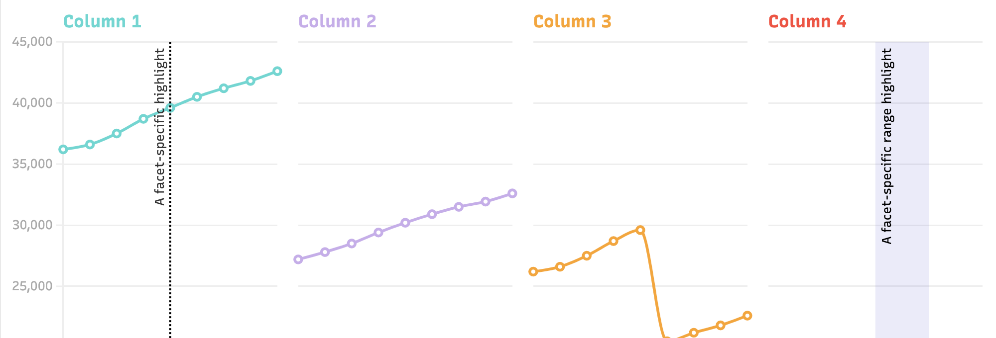
. Line, bar, pie: multiline axis labels, performance improvements, per facet annotations, line gaps, and new settings for dots and axes
. Survey: story highlighting, better colors and updated controls
. Table: improved layouts and more search options
Keep an eye on the new changelog for more!
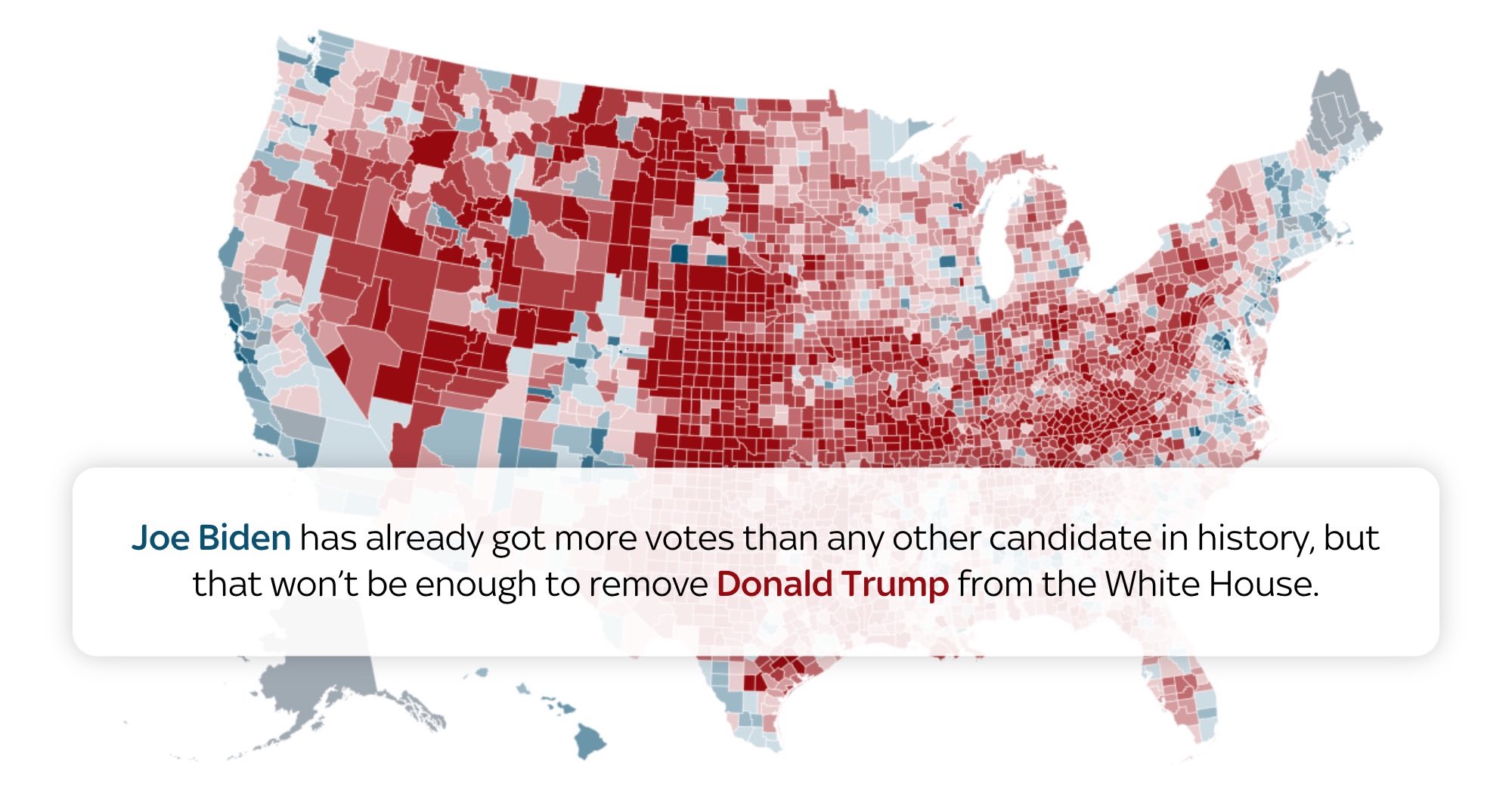
Biden's bar charts
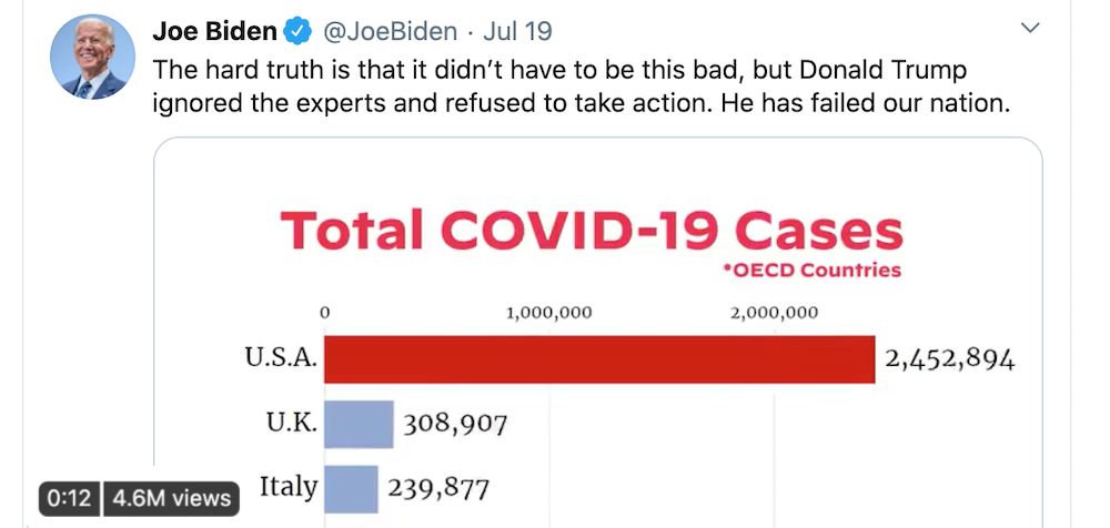
With the US election coming up, now is a great time to read last year's blogpost, "Ten ways to visualize elections data". One difference with this election is that one of the candidates is using Flourish to try to win! Indeed, Joe Biden's COVID bar chart race, made using Flourish in July, has been viewed nearly 5m times so far. Nice viz, Joe!
New developer docs
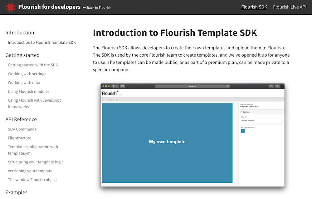
We just published an entirely new developer docs site with information about our SDK (for making new templates) and live API (for enterprise integrations).
. New Flourish developer docs site
We're hiring!
We have a few exciting positions open at the moment: visualization developer, software engineer and support intern. We'll also be looking soon for a dev-ops engineer. Please do apply or share the word.
. Come work with us
We'll be back in a few weeks with more updates. Until then, as always, just hit reply with any ideas, questions or feedback.
Best wishes,
Duncan and the Flourish team
Did someone forward this message to you? Join the list!


 Arts and Entertainment
 Business and Industry
 Computer and Electronics
 Games
Games Health
 Internet and Telecom
 Shopping
 Sports
 Travel
 More
More